Monday, September 26, 2011

MSSU Spiva Gallery September 2011


MSSU Spiva Art Gallery

            I find the art gallery small but yet packing a punch with flavor of a variety of interesting pieces of artwork. The majority of the art work has good balance, variety, similarity, and so on. Some of the colors used really is breathtaking and the techniques used with wood, glue, and glass in the shadow boxes is by far the best to me in the gallery. The teapots are definitely cool and work line of direction. The piece painted on canvas with the planes and the flies was different and one of those that cause you to stare and wonder for a very long time. The best painting to me was the one on the west wall with the blue clouds and bright green grass.
 
The porcelain sculptures were made by artist Joe Molinaro, while the paintings were made by artist Darryl Halbrooks. The paintings and sculptures were created between the years 2004 and 2010, in the town of Richmond, Kentucky.

Friday, September 23, 2011

Thursday, September 22, 2011

"On the Other Side" Exhibit, Spiva Art Gallery


"On the Other Side"
After viewing the Spiva Art Gallery’s show, “On The Other Side”, I have formed my own opinion on what is being displayed there.  When I first saw the pieces at the gallery I was very impressed.  I think the variety that the gallery had was very good.  By putting together pieces that dealt with the tornado that happened this year, with other very unique pieces gave me a huge range of emotion and respect for the work.  When I saw a piece that was a picture like oil painting of torn books and rubble from the tornado it immediately reminded me of everything I saw that day, mostly the people that were hurt and the ones that were helping, and it stuck with me.  Then, there was a small clay sculpture depicting an angel covering people from falling rocks, this was another one that suck with me.  The detail and time taken out of that artist’s day to create that was a lot, and it showed.  Overall, the Spiva Art Gallery was a very good experience and I play on going back to see some more art work.  We have a lot of talented artists that need to be exposed to the world more than they are being.

Many artists from Joplin and its extended areas created the pieces in this show. The artworks displayed in the exhibition were created within the last six months.

The Spiva Art Gallery exhibit, “On the Other Side,” was created essentially for the people of Joplin. Each piece, whether it is debris; a scene depicted through clay; or a simple pencil drawing, signifies the emotions and repressed feelings which cannot be expressed through verbal communication. The numerous works were made to show the how the people of Joplin are responding to the May 22nd tornado, which is clearly seen in a tree with no limbs but is completely covered in green sprouts, a crumpled up one way sign that has been mounted on a crude wooden cross, and a rendition of Edvard Munch’s The Scream taking cover in the depths of a bath tub. All the pieces of art seem to convey a sense remembrance, even a sense of unity, which shows how the city has banded together as an effect of the storm. In short, this exhibit is showing what all of the residents have been through and brings the outside closer to the soul of each that was affected by the Joplin Tornado.

 On the subject of form and concerning how it contributes, this could be taken a couple ways. First, it could be taken as how the form of the Spiva Gallery's actual architectural design contributed to the exhibition. In this case, I think it contributed a good vibe. You first walk in and are greeted by the guy behind the desk that informed you about what was being shown and what not. You then turn right down a hallway, with a piece of art beckoning you towards the end. You meet up with this art piece, greet it with your observant eyes, after which it welcomes you and introduces you to the room full of art that awaits your acquaintance to the left, in a very spacious series of rooms. Another way to take this is the gallery's interior design. This would include light, color pallet, floor type, etc. In this consideration, it contributed a good canvas for the exhibition. The lighting fell on the pieces very well and softly lit them without glare. The walls had a good undistracting neutral colors. I didn't notice the floor because, well, I was too busy looking at the art, which means the gallery did something right there too. 


"On the Other Side” is a very inspirational addition to the gallery. The title can be taken to allude to many different ideas, but one that is definite is the rebirth of Joplin after the May 22nd tornado. Throughout the gallery, there are numerous pictures, paintings, installations and collages that all refer to how the creator’s story relates to the bigger story of coming together for the greater good. The art that has come out of the incident here has proceeded to allow the community of Joplin to push to the other side of disaster and emerge reborn stronger and more cohesive than ever before.


"Detour" by Matthew Deheamers


 "Detour" by Matthew Dehaemers
 (Fish eye view of the regular image portrait in Joplin's I-44 Welcome Center)
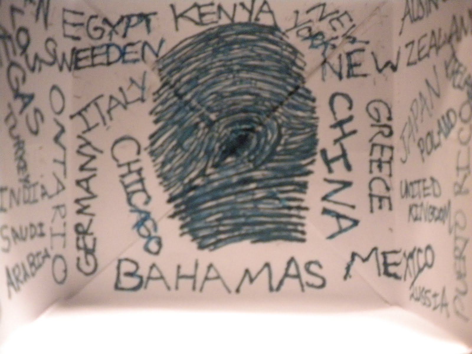
(Fish eye view of mural - you can see the word "Joplin" clearly enhanced and the imagery depicted)

                     The first response I had to the mural in Joplin at I-44 Welcome Center was a basic idea of the South-West Missouri area. The bold lettering of "Joplin" stood out to me the most, in the beginning. It gave me a sense of looking at a map or an atlas. Each letter in the painting represents something different, significant, and unique. The work of the art reveals to the tourist: what this area offers and what it's known for, both historically and presently. The subject of the mural consists of a dramatic scene of regionalism. The colors and graphics are eye-catching to the viewers. The license plates are a great idea in getting attention of all ages. I believe the detail and creativity put forth is outstanding. The composition as a whole is an appealing, friendly and welcoming piece for the community to enjoy!

                        The work was made in 2009 at the Joplin I-44 Welcome center. The piece of the art was commissioned by the Missouri Department of Transportation. It was made with Acrylic Latex and 500 plus recycled license plates. Mr. Dehaemers wanted to create a visual story about the history of Joplin Mo. Those who go see it see how much this city has changed and what there is to offer.

                       "Detour", a mural made by the artist Matthew Dehaemers, was made from the artists' passion and love for Joplin and other cities of what it has to offer and is known for. Matthew wanted the local community to be proud of the area that represents them and also for those visiting the areas to appreciate the honoring of the state on the wall of the Joplin I-44 Visitor's Center. An interesting point that Matthew has made was that he talked about his childhood game, the License Plate Game, and how he created a concept on the mural to put the license plates from all over the states. In this way children, as well as adults, would be interested as they walk into the door and also becomes and educational tool in the understanding and identifying the 50 states through the names and the distinctive images on each state's plate.

                       Detour is a massive wall size postcard created by Matthew that is created with acrylic latex paint, 500 plus recycled license plates on a medium density fiberboard (aka MDF). It is a larger than life mural from estimation around 12 ft high and 20 ft wide. The paintings are in the form of the word, "Joplin" and the license plates are in the background of the piece. The color is mainly yellow, warm colors contrasted by some cool colors. The faces are realistic but the painting is cartoony. It is a highly patterned mural by the repitition of the license plates and unsymmetrical. This mural pops out at you because it creates an almost 3-D sense and the vivid colors are also an enhancement.

                          The title of the work is "Detour". Detour means a long or roundabout route taken to avoid something or to make a visit a long the way. Detour helps illuminate the work because of the building itself, Joplin I-44 Welcome Center, a rest stop for visitors. People who drop by the Welcome Center also see the mural and in a way it is a "detour" stop to them because the mural is huge and captivating and located as soon as you enter. Inside each individual letter in "Joplin" are the themes that he worked on showing a variety of people, places and attractions or activities representing the area and depicts historical events as well. When visitors or even locals come here to study these, they educate themselves and possible become more interested and take that second route or "detour", adding that experience into their road trip. The work detour represents a scene of regionalism and an idea of the area combined together. It helps illuminate the work by using the license plates that are included in the art work and the Route 66 sign. Also the concept of it being a massive postcard reflects of that of someone traveling and sending a representation of where they are at or been in reflection to the visiting definition of detour. Overall, Matthew hopes to inspire visitor's out of curiosity to discover more about the subjects so that they may decide to take a "detour" through his work to the local area's or just the subjects historical events itself.

Self Portrait -

"Exploring Nature" by Sara Koul
Self portrait of Neo-Surrealism

Neo Surrealism: Depicts Imagery of dreams and the subconscious mind.

I created this using fine point sharpee marker. The image displays nature and me hidden among it because I love the natural world and the environment. It is an intuition of my subconscious and the image is appeared to be a dream fantasy art format. Before I started the piece I thought about something I loved most to do, watch and learn about. The image started with a waterfall which reminded me of hair and my imagination went from there. There is a little aspect of nature in the whole art piece tying everything together.

Benton Joplin Murals


            Walking in to the Joplin, MO City Hall building it didn’t take long to recognize the Benton Mural. It stands out off the white wall with strong, clear, vibrant colors. His depiction of Joplin in its earlier days was quite an interesting site to observe and let sink in. Looking at it put me in a place of fully feeling like I was actually there amongst the other people. It was almost as if I could feel the warm daytime sun shining on my cheeks while the soft cool wind gently flowed through my hair. Then as I looked to my right I saw his grandson’s mural. Just like his grandfather’s, I felt like I was walking down a road in Joplin. This setting however was a more modern time in Joplin history, and the scene seemed to be painted as though it was a little later in the day. The colors were not quite as vibrant, yet still stunning, and the sky was done a little darker. One thing that stood out to me as I was comparing the two was the fact that both murals have a mass of clouds just about in center of the sky. The Benton and Gude Murals are a great representation of Joplin’s history.

Both the Benton mural and the Gude mural were made here in Joplin. The Bento mural was opened to the public on March 24, 1913. He had decided he wasn’t going to do anymore large scale murals but after the Joplin public suggest that he finish his career where it started (he started drawing cartoons for the Joplin newspaper) he liked the idea and the mural was made to celebrate Joplin’s Centennial birthday. The Gude mural was opened on April 15, 2010. He was commissioned to do the mural for “Art in Public Places”.

In February 1971 Joplin centennial committee members Henry & Mary Warden requested Thomas Hart Benton to produce a mural in celebration of the upcoming event, which was in 1973. They wanted to commission him to paint a mural that would be publicly displayed in a Joplin government building on Third St. Hart was taken with the idea and a steady stream of letters, visits and phone conversations ensued for the next several months. The original request to depict a scene from the old House of Lords brought some concerns from Benton (who did a small study in oil of the painting, but not the large mural) when he was made to understand that the House of Lords had been a whorehouse and saloon. His concerns were with the people of Joplin who are even today part of the "Bible belt" and his unwillingness to offend them with the public display of the work. He offered the theme of the mining days as an alternative and things progressed from there. They settled on the theme of “Joplin in the Early Days” Although, gambling and drinking by the miners are depicted in the mural, The Holy Bible is prominently display in the lower center foreground of the piece which is the largest piece of art of the Benton collection displayed in City Hall. The piece was moved to its current location in the Newman Bldg. in March of 2005. It measures 5 ½ feet high by 14 feet wide and is done in an acrylic emulsion medium. The piece was dedicated on March 24, 1973. The original cost of the piece paid for by the city of Joplin was $60,000. Its current value is over $8 million dollars.

           The forms contribute a lot to the murals in very big ways. The giant oil canvas’s both are the same size, and are just big enough to make you feel small. The point of view of the people varies greatly, showing you a vast view, in a little frame. Vibrant colors take over both pieces of art making it feel like a strange, but wonderful trip. Yes the colors can make it seem a little unrealistic, but it also makes you have a great feeling inside from seeing it. The pictures both give you a focal point to rest your eyes as you take in such wonderful pieces art.

           The mural done by Tom Benton was titled Joplin at the Turn of the Century. The title portrays the way Joplin came about in 1896. It shows how Joplin started off with mining and then started to modernize as the years went on. Then the mural by Tom’s grandson Anthony Benton was titled Route 66. It portrays Joplin as a modern city that is on Route 66 and is also showing traveling west on Route 66.


Wednesday, September 21, 2011

Joplin Community Mural


When I looked upon the Joplin Mural, I was surprised on how massive it was and how much it towered over me. It gave me a sense of interest and awe when I tried to describe what I thought the mural meant to me. I think this would be in a regionalism classification. The mural reminds me of a strong local community, which some might consider to be a family. I feel that the mural represents a warm and family oriented community.


This massive mural is currently in the process of being painted and is to be dedicated on September 25th 2011. It is located in Joplin, Missouri on the corner of 15th and Main Street. As I was gazing upon the mural I had the pleasure of speaking to the lead artist behind this piece. His name is Dave Loewensein. However he was not the only one doing the work. There were others helping him out working on certain sections of the wall. He then mentioned to me that they also had the help of over 300 volunteers in the beginning. So it has definitely incorporated the community as well.

The Mural is dedicated to the citizens of Joplin. It is part of a tour put together by the Mid-America Arts Alliance, whose goal is to establish community-based murals in several parts of the country. Although the mural was planned before the May 22nd tornado, there are some elements from the tornado represented. “Our project has always been centered around the opportunity for community driven art to inspire, remember, and envision. As Joplin begins its long process of recovery, our project and how it can engage the community, may be more relevant and useful, pertinent and powerful than we could have imagined.” –Dave Loewenstein

"What is the first thing that you notice about the mural in Joplin? It’s big and it’s colorful, but does this really do anything for the overall piece or is it a bit much? When I ventured out on the public painting days, the mural was more or less a blank canvas, excluding the outline. I believe, upon first seeing the work, my initial response was, “Eh… it’s a mural.” The people around me, contributing to a valiant community art project, gave me a wonderful feeling… the lines on the sizable wall of Dixie Printing, did not. I felt that it was bland and lacking (reasonably and unreasonably so, since it was far from completion).


Fast forward a couple weeks, and this is my first time seeing the mural since then. Standing in front of this laudable piece, I realize that in my naivety I had made a hasty judgment. I feel as if I didn’t realize how big it actually was during our last encounter, but now that it has considerably more paint on it, it looks larger than life. The colors are loud and vivid and demand attention from every passerby. The size ties in well with the colors of the piece as well, giving the vibrant forms enough surface area to play while also chiming in to demand attention. The composition is playful and organic, but also brave in the sense that they didn’t play it safe with the forms; it seems as if the artists involved went all out and held nothing back. Which works because, after the recent disaster, that’s what the people of Joplin need: freedom, courage, play and to be able to walk into a kaleidoscopic scene while being embraced by color every step of the way." -Jordan Malcolm

The Butterfly Effect (which is considered a working title as of now and may change in the future) is a fitting name for the mural in Joplin because of how one event leads to another, whether that event is a pleasant one or not so pleasant. The imagery of the butterfly is used throughout the mural to help guide the view through the story being told, or drawn, by the children of Joplin. The events that have happened to Joplin through history have only made the town stronger and the effect of the most recent event is left in the hands of the children of Joplin. 

Dada da daaaaaaa!!

 My name is Chris Greninger and this is my dada self portrait. This is what happens when you take the red pill and follow that cute rabbit that just brushed up against your toes.

Tuesday, September 20, 2011

"Feisty Femininity" - Jordan Malcolm


This self portrait that I drew using pencils and charcoal was inspired by the Feminist Art Movement. I tried to use symbolism a little with the boxing gloves and ballet shoes to depict women's struggle with balancing femininity while also maintaining a strong and independent demeanor.
I say it's symbolism, but it's also pretty straight forward.. since I've been in ballet since I was 12 and I've been boxing for 2 years now. I also made myself pretty dirty and bruised up, which is also straight forward since I'm usually always covered in paint or clay from ceramics and generally get pretty bruised up in boxing. But I also wanted to make myself look a little unkempt to go against the idea that woman shouldn't look disheveled at any time. I feel like it's more socially acceptable for men to have a dirty hobby or profession then it is for women, even though people might not realize that they think this way.
For example.. after my guy friends get done in the ceramics shop downstairs, they are covered in clay and people ask them what their hobby is and what they've been working on. On the other hand, when I leave the shop covered in clay I get the ever popular "..What happened to you?" and many pitying glances from people debating on whether or not to give me a few bucks and hope I don't spend it on booze.
In essence, I feel like it's still considered a little unbecoming for women to be covered in anything besides glitter and perfume and so wanted to address that in this drawing since this is, more or less, a feminist stand point (and since I appear disheveled 80% of the time, even when I dress nice).
The paintbrush is clenched between my teeth because I enjoy painting and because it looks a little fierce.. and I feel like I'm pretty feisty.
It also looks a lot better on paper than it does on the computer but, eh, c'est la vie.

Monday, September 19, 2011

Surrealism: Ashley Payton

The way I did my self portrait was by using a photo I had. Then I use Microsoft powerpoint to change the image.

Sunday, September 18, 2011

Saturday, September 17, 2011

"Faudora" By: Racritia Hobson

I created my self portrait based on the art movement, Fauvism. Fauvism is french for "wild beasts" from artists using vivid colors in their pieces.

I named my portrait (Faudora) after my favorite hat I wore in this picture, not just because I really enjoy wearing the hat, yet because of how I made the hat stand out compared to the rest of the picture. I applied strong use of colors in the areas needed for shading and a vibrant background to bring it all together. Enjoy!

~Racritia Hobson~
Art Theory

Thursday, September 15, 2011

'Close at Hand' by Stephanie Easterly

This is my self portrait done in the installation style. I created a 3D box out of paper to represent a gallery room. On the walls of the gallery I would paint my thumb print along with all the places I want to go later in my life. Travel has always been a big part of my life. I was on a traveling volleyball team for 7 years during my middle school and high school years. I have been all over the USA but unfortunately I have never been over seas. Later in life I would love to travel more and leave my mark in many different countries. I thought the title 'Close at Hand' worked really well for this piece of art because the phrase 'close at hand' is used to explain something in your grasp ahead of you or in the future. Also, fingerprints relate to your hand just as the title relates to my work of art.

Bau Haus (Melinda Duncan)

"Self-Portrait"


My presentation was on Ethnic Art and this is the self portrait that resulted from that. I found that ethnic art told a story, and I wanted to put together something that told my story. 

I was born in Philadelphia to a mother that was addicted to drugs, and after putting me up for adoption, I was adopted 3 days after birth. My family has given me the help and support I need to succeed in life, and with that, I've been able to proceed my past and look forward to my future.

Tuesday, September 13, 2011

Op Art (Cory Moore)

My Op Art Self-Portrait. Used Photoshop of one picture and made it into several making it outline the original picture.

Thursday, September 8, 2011

Nolan - Color Field


This is my Color Field self portait. The original picture is actually a senior picture from a couple years ago. All of the effects in this picture (the neon effect and distortion) were done with powerpoint but can be done in photoshop as well. In this picture I didn't exactly know what to do, so I came to the conclusion that this self portrait needed to just be simple and basic, just like most of the paintings from this art era. What I have done is just simplified the lines and the background to make the original photo resemble something closer to the effect of abstract expresionaism instead of color field, but the two are very close together and usually go hand in hand. I felt the red was suitable for this because red is a vibrant color and many of the pieces that are seen in the color field era have color that seems to "pop" out from the canvas, which is what I feel is happening here. 

"Chloe"


    This is my ART DECO self-portrait. I was inspired by a painting, that I saw while I was researching, to draw myself the way I did. I just tweaked a few things and made it look more like me. I am wearing the uniform and holding a pom pom NOT because I am a cheerleader but because I am a dancer. I created this self-portrait not long after I made the MSSU Dance Team. (Ergo the green uniform.) All the excitement I was feeling was put into this composition. I feel that the stance I am in along with the colors and funky shapes expresses my personality well. 
   Like I said, this is my art deco self-portrait. I hope you enjoy it as much as I enjoyed creating it. 

Wednesday, September 7, 2011

I'm a Cubist. (Shane Smith)


This is a drawing I did of myself in the perspective(s) of cubism with ink on paper. I started off with the actual cube, and was just going to draw a caricature-like body, to be a smart aleck. But then I decided to go ahead and do an actual attempt at cubism. I noticed that most of the cubism paintings and drawings I've seen didn't leave out all realistic qualities, so I decided to do a more realistic approach at the top to a more loose style towards the bottom. Also I used hard lines throughout; it gave it a blueprint like quality.