Thursday, November 17, 2011

On Feminism: Ana Warner


Perfect curves, hips that swing just the right way, “soft skin, red lips, so kissable” to quote Katy Perry; sound familiar? That’s because this is the male ideal of a desirable woman. I decided to Google image search “paintings of women” just to see what it would come up with. All the seemed very gentle, weak, and all of the colors were smooth and soft. It was as if all these women were made of painted snow. For centuries, men have depicted women in this way. In fact, in a study done by the Guerrilla Girls in 2005, 83% of nudes in the Metropolitan Museum of Art in New York were of women. But what makes less sense is that only 3% of the artists were women themselves. Who decided that only the male perspective of the ideal woman was valid? Whoever this person is, Disney owes much gratitude to them; they’ve made a huge profit on this idealistic body.
For the longest time, the company has made movies starring princesses. They range from Snow White to The Little Mermaid. But although the outfits and culture of these girls will change from film to film, and era to era, one factor remains that holds them together. If one were to take an image of each of these princesses, lay them on top of one another, and hold them to the light, they would find that they all have the exact same figures. Triple zero waists, 36-25-38 measurements, every figure just the same. But once again, these figures were all designed from a male ideal of a woman’s body.
Now, just because these Disney princesses are portrayed in this manner as damsels in distress as well, doesn’t mean that everyone sees the Grimm brother’s Characters in such a way. Take Jeffery Thomas for example. He did a group of works which he entitled “Twisted Princesses”. Although the goal was to make the famous Disney girls look creepy, some of them seem to have lost the element of feminine weakness entirely; keeping the over exaggerated and verging on sexist curves, but displaying that they can keep their femininity while still displaying an almost Amazonian power.
Finally, take now the same basic element of a woman and place it in the hand of an artist who is a woman herself. The result may be something like Jenny Saville’s works. Jenny Saville is a feminist artist who paints nudes of heavyset women; some of which are against glass. These women may not be in the male ideal, but who says they aren’t just as beautiful?
Some might say that the Disney description is feminist art because it depicts the standards that women feel they need to meet, while others might say it’s just plain sexist and that Jenny Saville’s depictions are more feministic as they depict women whose bodies do not conform to the ideal. No matter how you look at it, curves will always play a major role in depicting women in art, and that is why it is an element of feminism.

On Feminism: Nolan Terrill


Throughout the course of history, women have been looked down upon.  Men have been the dominant players in typical American/world industries as well as the competitive business world, which pushed women into the background. After the forties, the tides began to turn. Women were establishing the ability to discover their true potential through various jobs in industry; especially in wartime. It wasn’t until the civil rights movement in the sixties when women stepped up to the plate as crucial, beneficial leaders, consequently convincing the nation and the world that they were a force to be reckoned with. Today women can be seen in almost every industry. They possess positions as supervisors, managers, and even CEO’s. The art world has captured this growing trend toward making the rights of women equal to those of men.  Women are at the forefront of this feminist style because they are the primary creators of the pieces that shed light on what the potential of the female sex is. A few popular artists include Judy Chicago, Frida Kahlo, Georgia O’ Keefe; however there are many more artists that fly “under the radar.” One of these lesser known is Maria Friberg. Her exhibit, Almost There, at the Elizabeth A. Sackler Center for Feminist Art (in Brooklyn, New York) consists of only photographs that seem to level the playing field between the two sexes. She shows the viewer how men and women, when in the right situations, can appear to have minute differences.  There is one image that stands out from the rest, though.

In this picture, four men lay in a pool. They seem to be helpless; trapped in existence. The men also appear to be weightless, meaning that they are of no importance to life around them and that their actions will not affect how they are viewed in the eyes of the public, or in this case, the water in the pool.  Each male is wearing a suit, which are all black and of the same style; this helps to group them together in order to signify the male sex as a whole or to show that they must conform to those around them before they will be fully accepted by the rest of the world. These traits and ideas are similar to the rest of the photographs that come from Friberg’s grouping. In each of these, the men are “fully capable of creating control, while at the same time it doesn’t seem possible for them to influence their own situation.” This description is also valid for how women felt prior to the sixties, for they were somewhat close to being independent but it was society that placed constraints upon them that disabled them from becoming their own, individual person.

Feminism is something that I endorse and agree with. Women are capable of being productive leaders. In the political arena, Hilary Clinton and Sarah Palin, even though controversial and polar opposites in opinion, have shown that they can influence a nation to vote for a certain political agenda and to convince people of a certain party to vote for in an election. Everyone in this nation knows who they are and how they are persons to put full attention towards.  Women bring to the table more critical views, as well as a totally different style of thinking than that of men. They are known to be more persuasive because of their persistence to accomplish a task and their unbreakable support for what they think is right and wrong; not just because of their looks. However, Women are the picture of beauty and are in most cases the definition of support. They are typically more sympathetic to a person’s cause and consider the full picture before jumping to a conclusion. Women may not be as physically strong as men, but are just as, if not more, dominant in their expressive and thinking capabilities.

Whether it is in art or politics, women are able to perform at the same level as men. Through the feminist movement they have shown how they believe they are equal to men. Artists, such as Maria Friberg, express their frustration to those who don’t believe that the female sex should be treated like the male sex. She displays this by putting men and women in situations that compare how masculine women can be to how feminine men can be. Friberg also puts the men into scenarios that make them seem of less importance or perhaps as a way to bring them down from their stereotypical high horse. Some people are still living in the past, for today is the age of women and minorities in general. Every day there is something profound happening to someone who most people would have never believed it to happen to: people are being proven wrong. It just goes to show that with perseverance and confidence, anyone can achieve something that overcomes the former belief that the unachievable can’t be done.

Brooklyn Museum- Elizabeth A. Sackler Center for the Arts: Feminist Based: Maria Friberg
http://www.brooklynmuseum.org/eascfa/feminist_art_base/gallery/mariafriberg.php?i=173

On Feminism: Chloe Spears

Kirsten Justesen, Sculpture II, 1969
550 × 413
http://www.moca.org/wack/?p=193


Feminist art aims to define and defend women’s rights politically, economically, and socially. Some pieces of feminist artwork subtly work in their ideas of femininity, others blast it at your face giving you no hope of getting past their point.

Being a woman myself, I know that even today, in the 21st century, women’s rights are not always as equal as people claim them to be; especially in art. History has undoubtedly proven that men reign over the art world. Think about it, from kindergarten to senior year and even on into college how many art icons have been pounded into your memories that were women? I would venture to say that the answer to that question could fit on one hand, if any even came to mind at all. Although this is a sad statistic for women, I don’t feel that there is a need to complain, I feel that there is a need to dare to change!

Simply complaining about an unfair reality will acquire nothing.  Gandhi said it best, “Be the change you want to see in the world.” When society places you, as a woman, into a box, do not just stay inside and complain. Show society why women are no lesser artists than men. I think that being born a female comes with an automatic challenge, and rising to it or whining all through life are the only options.

I hope that one day feminist art no longer exists. Separating women from the art world and placing them into their own feminist category, “box”, makes no sense to me. If this must be done, then I believe that men must be categorized as well.  Women need to realize that all the crap that society says about them and what they can and cannot do is exactly that. Crap!  Do not live under a bizarre idea that being a women artist makes you a feminist. Imagine, create, and live as an artist.

Wednesday, November 16, 2011

On Feminism: Chris Greninger


Graphic Feminist

Barbara Kruger is a female graphic designer whose works are quite genius when compared to other feminist art works in my opinion. Her main artworks basically consist of found photographs with text covering over the top. The text is white with a red band surrounding it with content such as “I shop therefore I am”, “Your body is a battleground”, and “Your comfort is my silence”. The text that is in the work questions the viewer about topics like feminism and consumerism.

This is where her work comes out and exceeds past other feminist arts I viewed. In most other works by feminists the art seems very straightforward and blunt about the topic by just showing a vagina or something along those lines. In other words, I don't believe it let the viewer engage in some critical thinking. It just blatantly just seems to bash you over the head saying “Here you go this is feminism!”

However with Barbara's work, it leaves the viewer to question what is being said. Is the person in the picture giving the saying or is this what the author is thinking? Whatever the case may be it still hooks the viewer and lets you interpret. Her work is designed quite well even though she is simply appropriating images from magazines and putting text over them. The posters have a style to them that is almost in a style of Russian propaganda posters. The red bands with white text pull you in and let you observe the image overall.

I think other artists that have feminist ideas should follow somewhat along the lines that Barbara follows. As a viewer, if I can instantly just see what is being communicated it most likely will not hold my attention. The feminist arts don't need to just point out images of girls and vaginas everywhere. It can have a more creative concept behind it that will surely hold the viewer longer and still communicate the same message without being so graphic.

http://www.associatedcontent.com/article/1624795/barbara_kruger_a_biography.html?cat=38

On Feminism: Robin Fjelstad

Feminist Art (Art or Pornography)


Part of the feminist art movement has a goal to bring more visibility to women in the area of art history. I fully support the agenda of this area of “the movement”. Female artists’ achievements and works have been overlooked and undervalued in recorded history and I believe that every effort should be made to rectify the injustice that has befallen these artists.  Female artists today proclaim that they simply want to produce art and have the same recognition that is given to white male artists, to have their works displayed alongside that of the male artist’s works in galleries and shows and to be taken seriously as artists. I also support this area of the “movement”.
There are other areas of the “feminist art movement” however, that I have a real problem with. One of these areas is the creation of “artwork” by feminist artists that is vulgar and pornographic. When white men produce images like those that I have seen produced by “feminist artists” it is called pornography and it is not on public display. I believe that this sort of female artist has hijacked what was intended as a crusade to get women artists the recognition they so richly deserve and have twisted it to meet a perverted agenda.  These women shout for equality and recognition, but their “art” is not of the type and caliber that is produced and displayed by other female artists or even their male counterparts. These images are focused on the female form displayed in graphic and crude arrangements and are obscene. I may not have seen enough art produced by male artists, but if all the work produced by men were phallic shaped images in some medium or other the credibility of these “artists” would suffer as badly as that of the feminist artist.
http://www.thehistoryblog.com/archives/5725  

On Feminism: Racritia Hobson


Feminist art is a highly significant movement consisting of the accomplishments and determination of feminists creating artwork symbolizing women's experiences in the world.  Feminist art began in the 1960s and continued for 10 years afterwards.  This movement defines the efforts of women, and for the recognition of their hard work.  However, feminist artwork is still being addressed today.  Artists and philosophers still create female art to state different messages.  For example, females being victims of abuse or abuse of power, being set at lower standards, and so forth.  

Nancy Spero is a pioneer of feminist art.  She began her work in 1961 to relay her views and beliefs on feminism.  Spero created illusion-type compositions to engage viewers while revealing her thoughts.  She bases a lot of her pieces on the torture of women in Nicaragua, the Holocaust, and cruelties of the Vietnam War.  One of her creations really caught my attention and drew my curiosity.  Women Bomb is a very unique representation of feminist renderings.  The painting has a single woman figure with multiple women reaching out into an ovary form.  The breasts and vagina on the woman make it obvious of the gender and the meaning behind it. 

I believe the remaining women blooming from the rest defines women being as "one."  This could perhaps reveal women build the same strength, mentally.  A message to further comfort women no matter what the circumstance: hope is there.  Another aspect that shouts, "feminism" is the shape of the composition.  The form creates female organs, ovaries.  I think this is the most powerful and important part to the art piece.  Overall, I actually found this angle quite interesting through the feminist movement and to be one of my favorites.       

On Feminism: Amanda Holcombe

While flitting thought all the prurient depictions of breast and vaginas in Women Artists in the 20th and 21st Century, I realized that there are few feminist and female artists who do not claim their sexual exploration as art. Frida Kahlo is one of these artists who chose to use her body differently than many feminist artists have in the past century.

Kahlo’s life was a short, seemingly agonizing life. Having experienced many health problems and accidents throughout her life, Kahlo’s work portrays and explores the mental and physical suffering that went along with her many surgeries, various amputations and multiple miscarriages. Considering that Kahlo never had any formal training in any type of art, her oil paintings are remarkably detailed and many of them dreamlike in style. Most of her work is self-portraits, which she said was “because she spent so much time alone and was the subject matter she knew best”. The self-portrait which grabs my attention most is The Broken Column. She compellingly depicts herself crying in a steal corset, a broken column representing her impaired spine, and nails put into her skin all over her body. Despite the fact that most of her pieces do have this dreamy, surrealistic style, Kahlo claimed that she never painted dreams, but portrayed her own reality.
Because her style echoes surrealism, I’m not sure that one should call her a feminist artist. However I chose her work because I find that it has more depth and power than many of the feminist artisst I came across. I believe her work to be more powerful because unlike many feminist artists, she goes beyond salacious portrayals of sex and the woman's body, and instead seeks to understand the pain her body and mind suffered from throughout her life by painting.
Resource: Women Artists of the 20th and 21st Century, edited by Uta Grosenick
The Broken Column (la columna rota), 1944. Oil on Canvas, mounted on hardboard, 40x31 cm

Wednesday, October 12, 2011

On Culture: Kahlief Steele


Symbols Are Universal

After having my interest piqued during the presentation of the Nkisi figurines, I was drawn to look at how more African art and craft involved the culture of the tribes there. After some research, I found that in the Ogboni and Oro associations of the Yoruba tribe, they created bronze or brass figures called onile. Onile represented the cofounding ancestors of an Ogboni lodge, and at the formation of a town and lodge, they were cast to ensure the unification of every member. The figures also represented the combined strength of all of the town’s citizens, and their commitment to conserve that power for the future. The figures were always cast in pairs, in order to also represent oneness between the ranks of denizens, both male and female.
The symbolism and meaning that the onile structures have to the culture is very intriguing to me because for the modern world, the precognition with statues made by ‘primitive’ African tribes is that they’re simply idols of false gods. With the onile, the statues represent cohesiveness and power to their culture, similar to what our 9/11 memorials and even the Joplin mural represent to our culture. The thought that these tribes place so much knowledge and craft on insisting their association work together is one that is very interesting and thought-provoking for me.
The Visual Arts of Africa, by Judith Perani and Fred T. Smith

On Culture: Shane Smith


Native American culture is one of my favorite cultures. It's something that I've always found interesting and powerful. Now that I am dating a half-blood Cherokee, I've had a new perspective on it; deeper insight and overall more respect overall. In a sense, culture is art. What gives a culture its essence is its rituals, clothing, language, food, music, and well, its art. I consider that art. In Native American culture, what stands out the most is their natural art. They have distinct patterns in their clothing and pottery, their face paint and even their bead work.


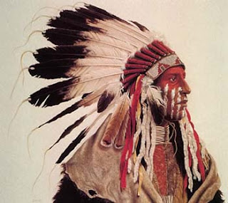
A piece of Native American art that appeals to me is an oil painting by Kirby Sattler named "Walking Storm". This is a portrait of a Native American man, and the title of the piece is his actual name. It portrays him in his head dress, his face painted in vibrant red and white war paint, buffalo skin over his shoulders, a choker around his neck, and clothing made of a hide of an animal. This epitomizes some of my favorite aspects of their culture; naturalness, yet intense badassness. Native men are usually very intense and display their dominance as a representation of their tribe; showing their colors and patterns. It is all very interesting to me, and I respect it immensely.


"Walking Storm" by Kirby Sattler http://kirbysattler.sattlerartprint.com/id22.html

On Culture: Sara Koul

Community Ties
The first thing that comes to mind when you hear Rwanda is about the great devastating genocide that occurred in 1994, depicted in the movies, "Hotel Rwanda", and "Sometimes in April". There was an exploitation and intensified division between Tutsi and Hutu over power over the country. The minority Tutsi, had controlled power for centuries, and the majority Hutu peoples, had come to power in the rebellion of 1959–62 and wanted to overthrow the Tutsi monarchy. The assassination of President, Habyarimana in April 1994 sparked a violent reaction, where Hutu's mass murdered Tutu’s of an estimated 1 million people over the course of 100 days. This was an awful, gruesome, devastating time for the people of Rwanda and I can't imagine going through that. As humans we need to go through a healing process when we witness devastation and destruction. In contrast we here in Joplin have gone through the devastating tornado that came through Joplin killing 162 people.  We too, ourselves are going through a healing process. We both in contrast have created a mural to desensitize the devastation that occurred and focus on the re-building and healing of the city and create hope again in the people.


The Rwanda Healing Project: Lily Yeh, founder of Barefoot Artists, working with genocide survivors in the Rugerero District near Gisenyi in 2004 completed murals that were designed and painted on the mud brick homes of the village. Concept: healing and transformation of individuals, families and community. Healing through remembering, Healing through art, Healing through creating hope for the future.

Joplin Mural : The Butterfly Effect: “Our project has always been centered around the opportunity for community driven art to inspire, remember, and envision. As Joplin begins its long process of recovery, our project and how it can engage the community, may be more relevant and useful, pertinent and powerful than we could have imagined.”
 –Dave Loewenstein

Tuesday, October 4, 2011

On Beauty: Ana Warner


To me, beauty shows the human condition, what’s going on in the world today, the changes people are happy about, and the injustices with which they are not. The image I chose was taken on April 22, 1970. There was an earth-day protest on which, the question was asked by the Mayor if New York City, John V. Lindsay, “Do we want to live or die?” during this time, it was a fight to end pollution, a fight that still goes on today.

The photographer who took the image still remains unknown as the credit line only reads “Associated Press”. Though the name of the freelance photographer is a mystery, there is no mystery behind the image which reflects the aggravation and frustration of the people fighting for reform. This image is beautiful. It seems to grab you by the shoulders and force you to ask yourself, “Is this really what our future could be like? Reduced to gas masks just to go outdoors?”

This photo captures one just one emotion, but many. The image itself isn’t full of hatred, but still manages to capture the passion of that day. It combines the present with what might become of the future. Similar art work, surprisingly enough, lies within some television shows, as well as political cartoons. A one panel comic I found showed 3 children waiting to see the principal. The first 2 were there because they had cursed in class, and the last was there because he had said “Christmas”. It’s a sign of the times where there is a push on everyone to be politically correct.

Another set of images which reflects the human condition are the ones that take the iconic “Evolution of Man” and add more to show what some people think life is going towards. One of these images, shows man evolving into a pig, another may show him evolving into an overweight man with a beer can in hand, and finally another may show man sitting at a computer desk with a caption that reads “Somewhere, something went terribly wrong.”

All these images have the same thing in common. They reflect the world either as it is or as it may become. The beauty lies within the ideas of what we as humans are becoming. Everyone may have different ideas, but be they favorable or undesirable, the art form is the world reflecting on itself; man’s inference on what their lives may become, what heights we can reach, what lows we may sink to. That is beauty.

On Beauty: Kahlief Steele


I believe that all pieces of art can be digested and mulled over to the point of beauty being found in it. As a result of that, I personally find a lot of different kinds of art both intriguing and beautiful. However, the group of art that sticks out to me the most in terms of aesthetics is art from the Impressionist era. The difference between the short, choppy and the lengthy, dreamy brushstrokes along with the mostly diluted color scheme make for a surreal experience when observing any sort of piece.
One piece in particular is The Road to Chailly painted by Claude Monet. The subject matter is a quiet forest scene, with the season of autumn in full force. Jagged brushstrokes of yellow ochre and a pale forest green highlight fallen leaves on the ground, and the beige, billowy sky gives the impression of a cool fall evening. The beauty of the piece definitely comes out in the colors, where contrast is used sparingly and where it is used, details spring out to the viewer with a melancholic sense of strength. I have a soft spot for landscapes, and that’s definitely one of the qualities that sticks out to me as an individual. The piece itself hearkens back to my own memories of walking through forests like these, simply soaking in all of the information through all five of my senses. The idea of recreating such a discreet scene with the tinted color scheme definitely whispers “this is beautiful” to me.

On Beauty: Chloe Spears


Some say, “beauty is in the eye of the beholder.” I disagree. I think that it lies somewhere much deeper than that. Works of art that were made to look exactly like what they are based upon are not beautiful. If an artist sits for hours examining one flower with the intention to recreate exactly what has already been created, how is that beautiful?  Beauty is only beautiful once.


When I step outside and see a crystal clear blue-sky, green grass that seems to glow from the ground, and flowers with such vibrant colors, that is beautiful. When I drive down the road and see a wall all decked out in graffiti that seems to jump off at you not only because of the color and composition but also the way it makes you wonder what went through the mind of the artist, that is beautiful.  Seeing a portrait of a person, no matter how well it is done, does not capture my attention and bring forth beauty. An artist could work on a project for years, duplicate exactly what is before him, put in all of the colors in the world and it would not scream beauty to me.


Chris Johanson’s “East meets West” installation, at the Institute of Contemporary Art in Philadelphia, suggests beauty to me. He did not replicate the scene exactly how it is. He saw it through his imagination. When an artist takes the time to let the subject set in, fully grasps and concentrates on the meaning, creates fact, and does not let their imagination run free, that will not produce beauty.


Beauty should not be so pain staking. It should not be stressed over or set on a time line. Beauty comes from the heart and the imagination. To create something beautiful, look beyond what you see.
source: Beautiful Losers –Contemporary Art and Street Culture

On Beauty: Amanda Holcombe


When you come across a painting of a landscape, you tend to be immediately bored. Let’s face facts, there are tons of paintings of landscapes out there; plenty of sweeping views of mountains with waterfalls or lakes with pine trees and fishermen in a boat in the middle of the lake. They become predictable. However, when I was looking through Gardner’s “Art Through the Ages”, the piece of art that struck me most within its pages was indeed, a landscape.
            The painting is entitled, Twilight in the Wilderness and was painted in the 1860s by Frederic Edwin Church. The sweeping red, orange, and pink clouds take up most of its space. The lighting of the twilight creates a dramatic effect upon the rocks and trees to the right side of the painting. The rest of the space is filled with mountains and between the mountains is a still, reflective river. I don’t enjoy this landscape because it is delightful and peaceful, and makes me want to go to where ever it is and have a lovely picnic. I enjoy it yes, for its natural beauty. I enjoy that what is portrayed on the canvas cannot be created or manufactured by man. And that what is depicted by oil paints has, depending on your views, been there for hundreds or thousands or millions of years before an artist decided to render it on canvas and call it art. I find that some landscapes can indeed be thought-evoking if you just give it a moment. Really look at how the light hits the bark of the trees, and creates shadows on the rocks. Appreciate the reflections on the water and the escape a painting of land can provide. The book in which I found this painting says this: “Twilight in the Wilderness dates to the 1860s, when the Civil War was tearing apart the country. Yet this painting does display evidence of turbulence or discord. Indeed, its does not include even a trace of humanity. By constructing such an idealistc and comforting view, Church contributed to the national mythology of righteousness and divine providence-a mythology that had become increasingly difficult to maintain in the face of conflict.”
            I agree with this. Nature has always been an escape for man, and I think it has been thus because it is a little humbling to be human it the midst of so much nature. I find the beauty of this to be timeless. And what is depicted in it is priceless.

On Beauty: Stephanie Easterly

What is beauty? Is beauty just a simply noun? According to Webster beauty is defined as the quality or aggregate of qualities in a person or thing that gives pleasure to the senses or pleasurably exalts the mind or spirit. What qualities does something or someone have to have to be considered beautiful? What is beautiful to one person might not be considered beautiful to another person, especially in art. 

People look at and interpret pieces of art in different ways.  I found a painting in the September 2011 issue of the magazine Art in America. This painting that instantly caught my eye was a painting done by Sam Francis which was part of his Pasadena Box Series. The painting was simply splatter paint in primary colors. This particular painting made me question beauty and what it personally meant to me.

When I think of beauty, I think of knowledge, wisdom, and a kind heart. Growing up I was taught that beauty was something on the inside of a person rather than their personal appearance. When I saw the painting done by Sam Francis, it reminded me of my kindergarten art teacher. My teacher was nowhere near what most people in our society today would consider beautiful in appearance. My teacher was a short stout female in her late fifties. Most days she wore her hair frizzy and untamed with glasses that had tape holding the left lens into the frame. You could look at her and tell she was an artist struggling from paycheck to paycheck. Although appealing genetics were not in her favor, she was one of the nicest teachers I ever had. She was extremely intelligent and passed her knowledge of art unto myself as well as my fellow classmates. The painting I saw in the magazine reminded me of my kindergarten years: the sloppy, messy paint splatters that my mother would still hang up on the refrigerator to show off. My paintings were usually in the primary colors, just like Sam’s, since those were some of the first building blocks of art that we learned in elementary school. 

The definition of beauty may be different to every person but no matter what, when a person thinks of beauty, whatever they think of makes them happy. Sam’s painting made me happy. It was a time machine that took me to my early childhood years when my teacher would share her art knowledge with me. She bestowed in me her knowledge and the building blocks that helped me grow into the artist I am today.  Even if she is not beautiful in appearance, my teacher had beauty of the heart and for that I will ever be grateful.

Pasadena Box Series by Sam Francis: Art in America September 2011 Issue

On Beauty: Rebecca Dunson

Trying to define beauty is like trying to explain colors to a blind person. There is a dictionary definition, but since everyone experiences it differently it really cannot be captured with words. The artwork I’ve chosen to help explain beauty is the Primitive Streak collection of dresses designed by biologist Helen Storey (helenstoreyfoundation.org). These dresses were designed to show what occurs within the first 1,000 hours of human life, beginning with the fertilization of the egg. The design that I liked best, and thought was most beautiful, was the Spinal Column Dress:


I think art is meant to capture inner being and soul of the creator, and still manage to reach out and affect the viewer. This dress shows, literally, what every person is made from, and that everyone is connected because we’re all made of the same stuff, DNA. Even though each person’s is a little different, we all have it and we all went through the process illustrated by Primitive Streak. These dresses are beautiful because they show that everyone is connected and that life is a miracle. Everything demonstrated in this line of dresses shows something that happens before a person has been alive for 41 days. It’s a miracle how two unrelated cells can grow into a living person, who has a heartbeat, limbs, their DNA, and more in less than two months.

Monday, September 26, 2011

MSSU Spiva Gallery September 2011


MSSU Spiva Art Gallery

            I find the art gallery small but yet packing a punch with flavor of a variety of interesting pieces of artwork. The majority of the art work has good balance, variety, similarity, and so on. Some of the colors used really is breathtaking and the techniques used with wood, glue, and glass in the shadow boxes is by far the best to me in the gallery. The teapots are definitely cool and work line of direction. The piece painted on canvas with the planes and the flies was different and one of those that cause you to stare and wonder for a very long time. The best painting to me was the one on the west wall with the blue clouds and bright green grass.
 
The porcelain sculptures were made by artist Joe Molinaro, while the paintings were made by artist Darryl Halbrooks. The paintings and sculptures were created between the years 2004 and 2010, in the town of Richmond, Kentucky.

Friday, September 23, 2011

Thursday, September 22, 2011

"On the Other Side" Exhibit, Spiva Art Gallery


"On the Other Side"
After viewing the Spiva Art Gallery’s show, “On The Other Side”, I have formed my own opinion on what is being displayed there.  When I first saw the pieces at the gallery I was very impressed.  I think the variety that the gallery had was very good.  By putting together pieces that dealt with the tornado that happened this year, with other very unique pieces gave me a huge range of emotion and respect for the work.  When I saw a piece that was a picture like oil painting of torn books and rubble from the tornado it immediately reminded me of everything I saw that day, mostly the people that were hurt and the ones that were helping, and it stuck with me.  Then, there was a small clay sculpture depicting an angel covering people from falling rocks, this was another one that suck with me.  The detail and time taken out of that artist’s day to create that was a lot, and it showed.  Overall, the Spiva Art Gallery was a very good experience and I play on going back to see some more art work.  We have a lot of talented artists that need to be exposed to the world more than they are being.

Many artists from Joplin and its extended areas created the pieces in this show. The artworks displayed in the exhibition were created within the last six months.

The Spiva Art Gallery exhibit, “On the Other Side,” was created essentially for the people of Joplin. Each piece, whether it is debris; a scene depicted through clay; or a simple pencil drawing, signifies the emotions and repressed feelings which cannot be expressed through verbal communication. The numerous works were made to show the how the people of Joplin are responding to the May 22nd tornado, which is clearly seen in a tree with no limbs but is completely covered in green sprouts, a crumpled up one way sign that has been mounted on a crude wooden cross, and a rendition of Edvard Munch’s The Scream taking cover in the depths of a bath tub. All the pieces of art seem to convey a sense remembrance, even a sense of unity, which shows how the city has banded together as an effect of the storm. In short, this exhibit is showing what all of the residents have been through and brings the outside closer to the soul of each that was affected by the Joplin Tornado.

 On the subject of form and concerning how it contributes, this could be taken a couple ways. First, it could be taken as how the form of the Spiva Gallery's actual architectural design contributed to the exhibition. In this case, I think it contributed a good vibe. You first walk in and are greeted by the guy behind the desk that informed you about what was being shown and what not. You then turn right down a hallway, with a piece of art beckoning you towards the end. You meet up with this art piece, greet it with your observant eyes, after which it welcomes you and introduces you to the room full of art that awaits your acquaintance to the left, in a very spacious series of rooms. Another way to take this is the gallery's interior design. This would include light, color pallet, floor type, etc. In this consideration, it contributed a good canvas for the exhibition. The lighting fell on the pieces very well and softly lit them without glare. The walls had a good undistracting neutral colors. I didn't notice the floor because, well, I was too busy looking at the art, which means the gallery did something right there too. 


"On the Other Side” is a very inspirational addition to the gallery. The title can be taken to allude to many different ideas, but one that is definite is the rebirth of Joplin after the May 22nd tornado. Throughout the gallery, there are numerous pictures, paintings, installations and collages that all refer to how the creator’s story relates to the bigger story of coming together for the greater good. The art that has come out of the incident here has proceeded to allow the community of Joplin to push to the other side of disaster and emerge reborn stronger and more cohesive than ever before.


"Detour" by Matthew Deheamers


 "Detour" by Matthew Dehaemers
 (Fish eye view of the regular image portrait in Joplin's I-44 Welcome Center)
(Fish eye view of mural - you can see the word "Joplin" clearly enhanced and the imagery depicted)

                     The first response I had to the mural in Joplin at I-44 Welcome Center was a basic idea of the South-West Missouri area. The bold lettering of "Joplin" stood out to me the most, in the beginning. It gave me a sense of looking at a map or an atlas. Each letter in the painting represents something different, significant, and unique. The work of the art reveals to the tourist: what this area offers and what it's known for, both historically and presently. The subject of the mural consists of a dramatic scene of regionalism. The colors and graphics are eye-catching to the viewers. The license plates are a great idea in getting attention of all ages. I believe the detail and creativity put forth is outstanding. The composition as a whole is an appealing, friendly and welcoming piece for the community to enjoy!

                        The work was made in 2009 at the Joplin I-44 Welcome center. The piece of the art was commissioned by the Missouri Department of Transportation. It was made with Acrylic Latex and 500 plus recycled license plates. Mr. Dehaemers wanted to create a visual story about the history of Joplin Mo. Those who go see it see how much this city has changed and what there is to offer.

                       "Detour", a mural made by the artist Matthew Dehaemers, was made from the artists' passion and love for Joplin and other cities of what it has to offer and is known for. Matthew wanted the local community to be proud of the area that represents them and also for those visiting the areas to appreciate the honoring of the state on the wall of the Joplin I-44 Visitor's Center. An interesting point that Matthew has made was that he talked about his childhood game, the License Plate Game, and how he created a concept on the mural to put the license plates from all over the states. In this way children, as well as adults, would be interested as they walk into the door and also becomes and educational tool in the understanding and identifying the 50 states through the names and the distinctive images on each state's plate.

                       Detour is a massive wall size postcard created by Matthew that is created with acrylic latex paint, 500 plus recycled license plates on a medium density fiberboard (aka MDF). It is a larger than life mural from estimation around 12 ft high and 20 ft wide. The paintings are in the form of the word, "Joplin" and the license plates are in the background of the piece. The color is mainly yellow, warm colors contrasted by some cool colors. The faces are realistic but the painting is cartoony. It is a highly patterned mural by the repitition of the license plates and unsymmetrical. This mural pops out at you because it creates an almost 3-D sense and the vivid colors are also an enhancement.

                          The title of the work is "Detour". Detour means a long or roundabout route taken to avoid something or to make a visit a long the way. Detour helps illuminate the work because of the building itself, Joplin I-44 Welcome Center, a rest stop for visitors. People who drop by the Welcome Center also see the mural and in a way it is a "detour" stop to them because the mural is huge and captivating and located as soon as you enter. Inside each individual letter in "Joplin" are the themes that he worked on showing a variety of people, places and attractions or activities representing the area and depicts historical events as well. When visitors or even locals come here to study these, they educate themselves and possible become more interested and take that second route or "detour", adding that experience into their road trip. The work detour represents a scene of regionalism and an idea of the area combined together. It helps illuminate the work by using the license plates that are included in the art work and the Route 66 sign. Also the concept of it being a massive postcard reflects of that of someone traveling and sending a representation of where they are at or been in reflection to the visiting definition of detour. Overall, Matthew hopes to inspire visitor's out of curiosity to discover more about the subjects so that they may decide to take a "detour" through his work to the local area's or just the subjects historical events itself.

Self Portrait -

"Exploring Nature" by Sara Koul
Self portrait of Neo-Surrealism

Neo Surrealism: Depicts Imagery of dreams and the subconscious mind.

I created this using fine point sharpee marker. The image displays nature and me hidden among it because I love the natural world and the environment. It is an intuition of my subconscious and the image is appeared to be a dream fantasy art format. Before I started the piece I thought about something I loved most to do, watch and learn about. The image started with a waterfall which reminded me of hair and my imagination went from there. There is a little aspect of nature in the whole art piece tying everything together.

Benton Joplin Murals


            Walking in to the Joplin, MO City Hall building it didn’t take long to recognize the Benton Mural. It stands out off the white wall with strong, clear, vibrant colors. His depiction of Joplin in its earlier days was quite an interesting site to observe and let sink in. Looking at it put me in a place of fully feeling like I was actually there amongst the other people. It was almost as if I could feel the warm daytime sun shining on my cheeks while the soft cool wind gently flowed through my hair. Then as I looked to my right I saw his grandson’s mural. Just like his grandfather’s, I felt like I was walking down a road in Joplin. This setting however was a more modern time in Joplin history, and the scene seemed to be painted as though it was a little later in the day. The colors were not quite as vibrant, yet still stunning, and the sky was done a little darker. One thing that stood out to me as I was comparing the two was the fact that both murals have a mass of clouds just about in center of the sky. The Benton and Gude Murals are a great representation of Joplin’s history.

Both the Benton mural and the Gude mural were made here in Joplin. The Bento mural was opened to the public on March 24, 1913. He had decided he wasn’t going to do anymore large scale murals but after the Joplin public suggest that he finish his career where it started (he started drawing cartoons for the Joplin newspaper) he liked the idea and the mural was made to celebrate Joplin’s Centennial birthday. The Gude mural was opened on April 15, 2010. He was commissioned to do the mural for “Art in Public Places”.

In February 1971 Joplin centennial committee members Henry & Mary Warden requested Thomas Hart Benton to produce a mural in celebration of the upcoming event, which was in 1973. They wanted to commission him to paint a mural that would be publicly displayed in a Joplin government building on Third St. Hart was taken with the idea and a steady stream of letters, visits and phone conversations ensued for the next several months. The original request to depict a scene from the old House of Lords brought some concerns from Benton (who did a small study in oil of the painting, but not the large mural) when he was made to understand that the House of Lords had been a whorehouse and saloon. His concerns were with the people of Joplin who are even today part of the "Bible belt" and his unwillingness to offend them with the public display of the work. He offered the theme of the mining days as an alternative and things progressed from there. They settled on the theme of “Joplin in the Early Days” Although, gambling and drinking by the miners are depicted in the mural, The Holy Bible is prominently display in the lower center foreground of the piece which is the largest piece of art of the Benton collection displayed in City Hall. The piece was moved to its current location in the Newman Bldg. in March of 2005. It measures 5 ½ feet high by 14 feet wide and is done in an acrylic emulsion medium. The piece was dedicated on March 24, 1973. The original cost of the piece paid for by the city of Joplin was $60,000. Its current value is over $8 million dollars.

           The forms contribute a lot to the murals in very big ways. The giant oil canvas’s both are the same size, and are just big enough to make you feel small. The point of view of the people varies greatly, showing you a vast view, in a little frame. Vibrant colors take over both pieces of art making it feel like a strange, but wonderful trip. Yes the colors can make it seem a little unrealistic, but it also makes you have a great feeling inside from seeing it. The pictures both give you a focal point to rest your eyes as you take in such wonderful pieces art.

           The mural done by Tom Benton was titled Joplin at the Turn of the Century. The title portrays the way Joplin came about in 1896. It shows how Joplin started off with mining and then started to modernize as the years went on. Then the mural by Tom’s grandson Anthony Benton was titled Route 66. It portrays Joplin as a modern city that is on Route 66 and is also showing traveling west on Route 66.